Always a Motor Transport Awards favourite, the Livery of the Year Award winner for 2018 will be revealed on 4 July at the Grosvenour House Hotel. Sponsored by Pirelli the award sees nominations for Caterite Food and Wineservice, Hermes UK, Howard Tenens, Palletline and Vision Express.
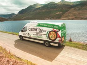
This Lake District-based delivery wholesaler runs a fleet of 50 temperature-controlled vans, which had featured the same livery for a number of years. The business wanted to make a change to set it apart from its competition while demonstrating how forward-thinking it is as a company. It chose to move away from a traditional, corporate design to the colourful variable design it ended up with. Caterite said the use of different images on different parts of the van gives it flexibility to adapt different parts of the livery for different vehicles while maintaining a uniformity that makes them recognisable as Caterite vehicles.
Judges commended Caterite for the investment and pride in the new design, especially given the smaller size of the business compared with its fellow finalists. One said Caterite had shown a strong strategic approach to the redesign and produced “a great and striking update”, while another described the livery as “a creative expression of the company’s services executed well in the design”.
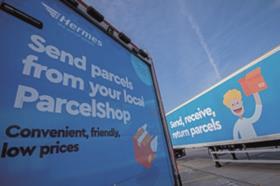
Hermes is going to great lengths to evolve into a technology-driven B2C parcel carrier – a conscious departure from the B2B focus it has presented to date. Its new livery is a reflection of this shift and is designed to showcase its new B2C strapline: the parcel people. The illustrated person featured on the livery was designed to be personal and recognisable, and Hermes said another advantage is that the character can be animated for use in short videos and graphics on its social media. It also has the capacity to adapt the illustration for specific customers or seasons.
Hermes executed a rapid roll-out of the new livery, putting it on 164 trailers over two weeks at a variety of depots, with 128 remaining.
Judges enjoyed the simplicity and clarity of the new livery and agreed it was a quick and effective way to communicate Hermes’ new direction.
“I like the cleanliness of it,” said one judge. “It clearly promotes the service and looks professional and without fuss.”
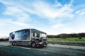
Howard Tenens has focused on reducing its carbon footprint since 2008, and in October 2017 it bought two CNG-powered Scania rigids. The operator wanted to celebrate its investment and designed a livery that would make a “powerful statement” about its environmental commitment.
The simple Cleaner Planet design, partly inspired by BBC’s Blue Planet, was created to be modern and eye-catching. It said it wanted to present the planet as precious cargo that it is doing its bit to look after. This, it hopes, will have a positive effect on the general public’s perception of the transport industry.
Howard Tenens intends to apply the livery or a variation of it to any alternatively fuelled vehicles it buys in the future.
Judges described the design as sleek and stunning. “This is an exceptional design and execution of an important message regarding sustainability, environmental responsibility and the company’s commitment to this objective,” one judge said.
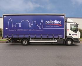
Palletline’s Modern Lines livery was designed to play on the second half of its company name and celebrate the regions its network covers with recognisable skylines. The livery design has multiple variations deployed in the regions they relate to. This, the network said, encourages the public to look at the vehicles and feel proud of their areas and landmarks while enabling them to have stronger customer engagement. The network hopes 30% of its fleet will carry the new livery by the beginning of 2019, with roll-out well under way.
Judges described the livery as striking and evocative of a strong sense of community. One judge said: “This is a clever design that incorporates its brand objectives with a fantastic use of regional targeted marketing.”
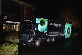
The RHA and Vision Express designed the Vision Van as an ‘eye’-catching mobile eye clinic that would travel the country offering eye tests and promoting good eye care. While the large eye design and branding acts as an advert for the van and its work, it is also intended to remind all road users to have their eyes tested regularly.
Judges were particularly impressed with the reflective film used on the Vision Van’s eye feature, which makes for a striking, stand-out image when the vehicle is driving in the dark. One judge said: “It was an excellent idea of the RHA to pair with Vision Express to promote eye health. Its work is good for the transport industry but the livery makes it relevant to all road users who see it. Extremely eye-catching, this is one of the best liveries I’ve seen for a long time."

