


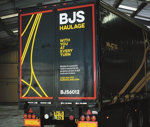
BJS Haulage
The aim of the project was to develop a beautifully simple graphic homage to the intricate design of motorway junctions. Each one, in a series of 20, was specially selected not only for its beauty but to celebrate the locations of some of the company’s most trusted and long-standing customers.
On the cabs, it set its golden-yellow colour against a satin black wrap, applying minimal graphics and a subtle logo position to enhance the "stealth-like qualities of the Renault". The result is a livery that aims to quietly demand attention among the noise of the busy UK transport network.
The judges said: “This was a modern, fresh livery with a fun twist; a lot of thought had gone into it with a good supporting narrative; it was a novel idea and I loved the link to its slogan – With You at Every Turn, that was very clever; the cabs were also named after key worker heroes, which was a nice touch.”
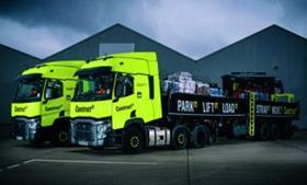
Construct IT
Construct IT looks to add the digital know-how essential for today’s construction manufacturers. Its dual USP of safety and technology gave it a focused brief to develop its name, brand and livery. Being a start-up, its trucks needed to work extra hard to introduce what it is, what it does and why it does it. Its name helps it clearly communicate to not only the haulage sector it works in but also its technological focus in IT systems.
Construct IT’s livery is based on what it describes as a head-turning safety-inspired fluorescent yellow, ensuring it would get noticed on the dullest of days. The neon colour pallet does more than just look good; it also makes the vehicles highly visible for all the right health and safety reasons.
The judges were impressed with the bright and inventive use of branding: “The slogans and colours are striking; wow, if that came down the motorway you wouldn’t miss it.”
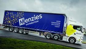
Menzies Distribution
Menzies Distribution believes vehicles, warehouses and people form the first touchpoints to a logistics brand. It wanted to paint a strong, positive image of the transport industry and began a project to refresh the company’s image. “How we look, sound and behave should be a clear reflection of who we are, what we believe and what we aim to achieve. So we set out to introduce a brand that is punchy, bold and different, built on three core pillars – smart, agile and sustainable,” it said.
The livery needed to reflect Menzies’ brand promise of 24/7 national capability and work on multiple vehicles. It also needed to fit with the newly acquired Bibby Distribution (now Menzies Distribution Solutions) business and fleet. The core focus was about driving the future, seamless integration and honouring a sense of the past.
The judges said: “This was a clean design that worked well across all vehicle types and sizes; it was great to see how it could transfer across to zero emission vehicles; that’s a positive image for the industry as well.”
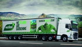
Westland Horticulture
The Westland fleet run by KNP Logistics Group delivers to more than 2,000 garden centres a week. Part of the contract distribution solution allowed the firm to introduce 20 branded trailers into the fleet.
Creating the livery was a relatively quick process. It was important that the vehicles delivered the Westland logo – their core brand message, a key product and the website. It was also important that the seven trailer designs across the 20 trailers worked together as a recognisable branded suite of vehicles. With seven variants, the design is clear and impactful and works cohesively across the fleet. The company described the initiative as a branding opportunity that couldn’t be missed.
The judges said: “I like that it has seven variants but all recognisable with a horticultural theme; you could tell what it was; it had some clear objectives on what it wanted to achieve; it was a no-nonsense approach done quickly with a great result.”