


With the addition of Nelson Distribution and Steve Porter Transport to the Knights of Old portfolio, the larger brand was becoming increasingly diluted.
The organisation therefore decided to move to a new three-letter name – KNP – to offer a more international appeal while maintaining each individual brand’s distribution identity.
The group realised it needed to move with the times, but the new brand needed to feel familiar, as if it had evolved from Knights of Old. It also needed to stand strong among the other three-letter logistics brands, own its colours and reflect KNP’s personality and target customer traits.
The new livery is slanted in the same way as the existing Knights of Old logo and uses the same colours. But the increased size of the logo was recognised as a way to uniquely position the new KNP brand among its three-letter competitors.
The aim was to introduce something simple, bold and easily identifiable with a timeless feel. It was also decided the existing strapline – ‘Service with honour’ – was restricting and reinforced its ‘traditional’ image, particularly in the EU. Instead, a descriptive and aspirational strapline was needed. The result? A new KNP strapline: ‘Logistics for life’.
The whole rebranding exercise was conducted in-house to maintain full control, and many variants of the new brand were trialled. But ultimately KNP – signifying Knights/Nelsons/Porters – won out and KNP Logistics Group was purchased as the name for the holding company.
The group admitted it had previously lacked a core identity. However, the rebranding has united the entire portfolio, bringing internal and external brand clarity. It had previously proved difficult to explain to potential customers that Knights of Old, Nelson Distribution and Steve Porter Transport had shared directors. But the new livery has succeeded in positioning the brand beyond local to UK/EU audiences and creates a portfolio that won’t be perceived as traditional.
Our judges were impressed by the clarity of thinking behind the livery which they say fits perfectly with the wider rebranding exercise.
“The actual livery is simple, yet effective. I'm sure these vehicles will be easily recognised on the road,” said one judge. “I like the transition and evolution from old to new, which will make it easier for customers to assimilate and recognise. The livery is clean, crisp and distinctive.”
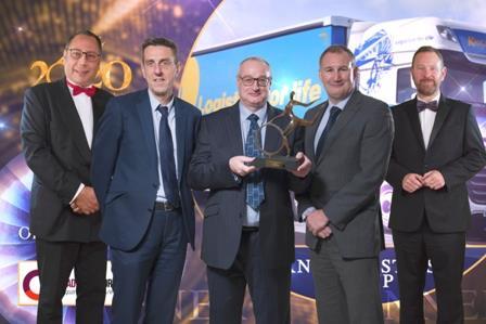
"It’s perfect timing in terms of the creation of KNP Logistics Group. To form the new group, which is an amalmagation of the three companies, and win the award at the same time is absolutely fantastic – it’s excellent!"
Simon Nelson