


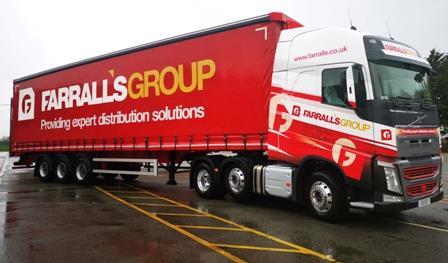
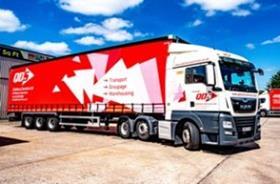
Farrall’s Group
Key to the organisation’s recent rebranding as Farrall’s Group was a desire to create a striking and professional livery with a modern lease of life.
A new main icon was introduced - a combination of the F & G from Farrall’s Group - which looks to highlight the company’s ability to work as a team.
The existing colour palate of red and amber was retained but with more depth and flare than in previous designs.
Farrall’s also introduced a new strapline - ‘Providing expert distribution services’ - for its delivery vehicles.
Our judges were impressed by how well the new livery demonstrates the group’s values and relates them to the design. “The colour scheme maintains the continuity of the brand and brings it into a modern focus,” one said. “The simple mission statement puts the business goal out there for all to see.”
KNP
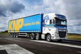
With the addition of Nelson Distribution and Steve Porter Transport to the Knights of Old portfolio, the larger brand was becoming increasingly diluted.
The organisation therefore decided to move to a new three letter name – KNP – that would align it beyond local to a more international audience while maintaining each individual brand’s distribution identity.
The aim was to introduce something simple, bold and easily identifiable with a timeless mark. A new strapline was also introduced: ‘Logistics for life’.
Our judges were impressed by the clarity of thinking behind the livery which they say fits perfectly with the wider re-branding exercise.
“The actual livery is simple, yet effective. I'm sure these vehicles will be easily recognised on the road,” said one judge. “I like the transition and evolution from old to new, which will make it easier for customers to assimilate and recognise.”
Malcolm Group
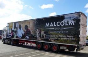
The Malcolm Group has been a corporate member of international development organisation Transaid since 2014 and uses one of its walking floor trailers to spread its message.
In 2015, the group created a highly visible communication on what has become a very successful template. This led to a brand new design in 2019 using powerful images of the vital work that Transaid does across Africa.
This new trailer was dedicated to Jayne Gray, a Scottish haulier and Transaid fundraiser who was fatally injured in a road traffic collision during the Cycle Zambia Challenge in 2018.
“Malcolm Group have taken a distinct and thoughtful route with this livery choice,” one of our judges said. “By focusing upon charitable purposes, they have emphasised the connection between larger transport contractors and the communities that they serve. There’s a common theme running across each of the vehicles and the livery they carry.”
Q Delivery Services
Launched in 2011 with just one van, Q Delivery Services lacked a strong visual identity and owner Justin Young realised he needed to use his vehicles to build his brand, create an air of professionalism and present a positive image.
He branded his entire fleet for the first time in 2019 with new livery, a move which quickly delivered greater exposure throughout the local marketplace and community, new business wins, a 58% increase in turnover and multiple award wins.
The new livery aims to be clean and clear - white on red - and the inverse, in solid colours looks to ensure a crisp, unfussy layout that can be easily distinguished by the public and customers.
“This is a quick, strong, and striking livery solution that brings in clever design techniques and abstract imagery to deliver the company message,” one judge said.
Roberts Bakery
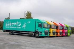
Roberts Bakery has recently begun to update the design of its delivery vehicles, which aim to communicate its striking signature identity, quirky personality and attitude.
The entire 41-strong fleet was set to be wrapped with the new livery by July 2020.
The work has been carried out in conjunction with partner, AST, which has stripped the existing graphics from the DAF box vans and re-painted them before applying the new artwork.
The livery designs are based on the brand’s bold and bright colourways with simple but impactful brand copy.
The brand’s Early Bird mascot also takes centre stage, telling the world how the company is ‘shaking up baking’, ‘going against the grain’ and ‘challenging stale thinking’.
“The single colour is unusual, vivid and striking,” one judge commented. “It’s quirky and reflects their brand well. I also like the lettering in the shape of bread roll configurations.”